


Review of
Fantastic Four (1961) #1
Published:
November 1961
Reviewer Rating:
Avg User Rating:
(3.67)

Even though any fan of the Fantastic Four knows the story inside and out, there's still a lot of pleasure to be had revisiting their first appearance, at the dawn of the Marvel Age. Like most of the company's central creation myths, this is a story we've seen retold and refined again and again over the years, but even though I'm not enough of a scholar to point you to the best telling of the FF's origin story ever, 52 years later, Kirby and Lee are still in with a shout.
The most remarkable aspect of the issue to me is the way scale affects the feel of the story. Kirby's compressed storytelling, with big temporal and spatial leaps from one tiny panel to the next, couples with Lee's breathless pulp narration to give the whole thing a breathless, intimate quality. You really get the sense of how this whole thing hinges on the whim of one brilliant man, and how the complex interpersonal relationships between him and his closest friends and family both enable his madness, those others adding madness of their own to let the whole thing spiral out of control. Johnny's the only one who comes off as innocent, even as inessential. He doesn't contribute particularly to the snowballing tension, and without him, the whole thing would still have played out the same. The details and emotional travails of the illicit flight, the assault of the cosmic rays and the subsequent transformation have all been fleshed out further in later versions of the tale, but the original still hits some pretty perfect notes all the same.
Most of those can be attributed to Kirby. Even though this isn't The King at his free-form best, almost twenty years into his career, there's a level of craft and imagination at display here to thrill the heart of a comics fan. Just about every panel is worthy of being blown up to poster-size (and every single of them would hit harder than Lichtenstein's pale copies), every sequence deserving of close analysis into how exactly how little you need to create a sense of continuity and story flow, if you do it right. So much action happens in close-ups, or off-panel, or cropped, but there’s never a sense that Kirby is depriving the reader of spectacle by eschewing big splashes and spreads. Instead, the often impressionistic framings contribute to the aforementioned sense of urgency and breathlessness. The best example of this, and perhaps my favourite page of the issue, is the sequence depicting the cosmic ray bombardment. Plenty of the familiar details and imagery associated with this scene is nowhere to be found in Kirby’s version. Instead, we're served up a grid of minimalistic exterior shots of the rocket, interspersed with claustrophobic, horror-like close-ups from inside the cockpit, all lurid block colours and contrasts, the wonderfully kirbyesque cosmic ray overlays and simple sound effect ("RAK TAC TAC TAC") enhancing the stifling scene of the frantic four stuck in a death-trap of their own making.
Yes, It's easy to get locked into Kirby-praising mode when talking about these books, so let's not forget that Lee's words play a huge role in giving momentum to the storytelling. Even if some might bristle at the relentless pulpiness of his voice, any accusation of wordiness belies the fact that every caption box and word balloon seems tailored to driving the story forward, clarifying what we're seeing without over-explaining, nudging us along while making sure that we take the proper amount of time to marvel (no pun intended) at what we’re seeing. Yes, his prose is an acquired taste, but you can't discount the effortless way in which his choices facilitate the work of his collaborator.
Subsequent generations of writers and artists have strived to add scale to one of the most important origin stories in superhero comics, but it can't hurt to remind ourselves that there’s virtue in telling a big story in a small way.
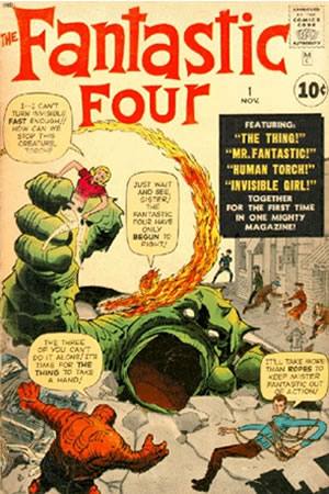
- Judging by the small scan on this Reading Order page, I think Marvel should add a slightly sepia-toned overlay to all their reprints, since it looks a damn sight better than both my Masterworks trade and the MDCU version. Or maybe the colours looked that great back then, and all the blame should be put at Digital Chameleon's door for an overzealous reconstruction job. Anyone have a vacuum-sealed, good-as-new copy of FF #1 I can borrow for comparison?
- That iconic cover image is swamped with text, but it holds its own quite nicely. I'm going to attribute a considerable amount of the effect to Kirby's judicious use of negative space, giving extra contrast and oomph to that fabulous Saul Bass-esque logo, along with Johnny's flame tail and Sue's Fay Wray pose.
"And I'll call myself Mr. Fantastic!" is one of the best laugh lines in the history of Marvel Comics. I know recent years has seen the codename explained as Reed being facetious and/or self-deprecating, but in the original, played-straight version it's still pretty hilarious.
- I'm not saying the rest of the FF are given fathoms of depth in this introduction, but aside from goading Ben into piloting the ship against his better judgment, Sue is pretty much a nothing character in this issue. Unless, of course, you consider her nascent power to be some sort of meta-commentary on the flimsy female characters in comics at the time.
- I don't know if it's some sort of error, but the outer gutters of the MDCU version of the book are twice as wide (if not wider) than the ones in my Masterworks TPB. And I love it. It makes me yearn for a time when full-bleed was the exception, not the rule.
The most remarkable aspect of the issue to me is the way scale affects the feel of the story. Kirby's compressed storytelling, with big temporal and spatial leaps from one tiny panel to the next, couples with Lee's breathless pulp narration to give the whole thing a breathless, intimate quality. You really get the sense of how this whole thing hinges on the whim of one brilliant man, and how the complex interpersonal relationships between him and his closest friends and family both enable his madness, those others adding madness of their own to let the whole thing spiral out of control. Johnny's the only one who comes off as innocent, even as inessential. He doesn't contribute particularly to the snowballing tension, and without him, the whole thing would still have played out the same. The details and emotional travails of the illicit flight, the assault of the cosmic rays and the subsequent transformation have all been fleshed out further in later versions of the tale, but the original still hits some pretty perfect notes all the same.
Most of those can be attributed to Kirby. Even though this isn't The King at his free-form best, almost twenty years into his career, there's a level of craft and imagination at display here to thrill the heart of a comics fan. Just about every panel is worthy of being blown up to poster-size (and every single of them would hit harder than Lichtenstein's pale copies), every sequence deserving of close analysis into how exactly how little you need to create a sense of continuity and story flow, if you do it right. So much action happens in close-ups, or off-panel, or cropped, but there’s never a sense that Kirby is depriving the reader of spectacle by eschewing big splashes and spreads. Instead, the often impressionistic framings contribute to the aforementioned sense of urgency and breathlessness. The best example of this, and perhaps my favourite page of the issue, is the sequence depicting the cosmic ray bombardment. Plenty of the familiar details and imagery associated with this scene is nowhere to be found in Kirby’s version. Instead, we're served up a grid of minimalistic exterior shots of the rocket, interspersed with claustrophobic, horror-like close-ups from inside the cockpit, all lurid block colours and contrasts, the wonderfully kirbyesque cosmic ray overlays and simple sound effect ("RAK TAC TAC TAC") enhancing the stifling scene of the frantic four stuck in a death-trap of their own making.
Yes, It's easy to get locked into Kirby-praising mode when talking about these books, so let's not forget that Lee's words play a huge role in giving momentum to the storytelling. Even if some might bristle at the relentless pulpiness of his voice, any accusation of wordiness belies the fact that every caption box and word balloon seems tailored to driving the story forward, clarifying what we're seeing without over-explaining, nudging us along while making sure that we take the proper amount of time to marvel (no pun intended) at what we’re seeing. Yes, his prose is an acquired taste, but you can't discount the effortless way in which his choices facilitate the work of his collaborator.
Subsequent generations of writers and artists have strived to add scale to one of the most important origin stories in superhero comics, but it can't hurt to remind ourselves that there’s virtue in telling a big story in a small way.
- Judging by the small scan on this Reading Order page, I think Marvel should add a slightly sepia-toned overlay to all their reprints, since it looks a damn sight better than both my Masterworks trade and the MDCU version. Or maybe the colours looked that great back then, and all the blame should be put at Digital Chameleon's door for an overzealous reconstruction job. Anyone have a vacuum-sealed, good-as-new copy of FF #1 I can borrow for comparison?
- That iconic cover image is swamped with text, but it holds its own quite nicely. I'm going to attribute a considerable amount of the effect to Kirby's judicious use of negative space, giving extra contrast and oomph to that fabulous Saul Bass-esque logo, along with Johnny's flame tail and Sue's Fay Wray pose.
"And I'll call myself Mr. Fantastic!" is one of the best laugh lines in the history of Marvel Comics. I know recent years has seen the codename explained as Reed being facetious and/or self-deprecating, but in the original, played-straight version it's still pretty hilarious.
- I'm not saying the rest of the FF are given fathoms of depth in this introduction, but aside from goading Ben into piloting the ship against his better judgment, Sue is pretty much a nothing character in this issue. Unless, of course, you consider her nascent power to be some sort of meta-commentary on the flimsy female characters in comics at the time.
- I don't know if it's some sort of error, but the outer gutters of the MDCU version of the book are twice as wide (if not wider) than the ones in my Masterworks TPB. And I love it. It makes me yearn for a time when full-bleed was the exception, not the rule.